Wednesday, 7 October 2015

Summer work

So uni has started back up again and let me tell you it's all go all the time and it's currently only the third day. For the first blog post of the year I'm going to show you some stuff I did over the summer which I'm proud of, then some interesting news...

Over the summer I mainly spent my time practicing my digital painting skills as my Photoshop skills were non existent. The majority of these paintings are portraits of actors, celebrities or just life models, however I have worked on painting some animals for practice. 


As you can see this first one is Angelina Jolie which I spent a great deal of time on as this was my first ever digital painting in colour. Hair is a pain but I love it either way.

Leslie Knope a character from Parks and Recreation (a show which I am heavily in love with) is one of my favourite characters and here she is in my style. 


 This is one of my favourite and most loved pieces of work. I spent so much time on getting this one right and I think I achieved that. I chose to experiment with my style in this painting and I'm super pleased on how it came out in the end. I don't know whether you've heard of a show called Wentworth but it is one of the best gripping and intense drama's I've ever seen. Please go give it a watch! 

 This is a painting I did of Ali Micheal, it was actually my first digital portraits.

After seeing Jurassic World I once more became obsessed with dinosaurs and wanted to paint a t rex of course so here she is. 
 I don't usually paint animals so I decided to practice. This is Marge the cutest pitbull ever. I really enjoyed this painting. 
So that's what I've been doing over summer and now for the big announcement... 

this blog is moving to my new website and blog made with Wix and it's actually fab I hope you all go take a look as that will be where I will be publishing all my new blog posts for the final year. 

Tuesday, 12 May 2015

Off the Map: Post Mortem

Off the Map hand in was last Friday and I'm pleased to say the least although work can still be done on it for the actual competiton hand in date which is sometime in June I think.

Like a lot of other people when we first got the brief I had lots of ideas and thought it had great potential. I wasnt too fussed about being given a group at random however as none of us had worked together before I think it was a bit difficult to get started. 

At first the project was set to be a sidescroller and nothing more howeverthe brief was opened up so we could chose to do anything however we stuck with the sidescroller idea as we had done some research on that type and had some ideas. We all worked on moodboards to get a general feel for what we would like in a sidescroller game and what each of us personally like.


I think it took us awhile to decide because we had all looked at sidescrollers and we couldn't deicide on an art style so we were floating around on nothing for awhile. That's when Imogen had shown us a clip of a video game that very stylised and 'faceted' which matched the concepts she had started.

The concepts I had come up with were fairly basic and average. Let's say concepting isn't one of my strong points but I tried my best. I had some garden areas of the level and the rabbit hole to concept and design. I also tried to come up with some puzzles for the game and one of them was used for a room adjacent to the rabbit hole.


We had all worked on our concepts separately which looking back on it wasn't a good idea because they were all kind of separate and didn't match well together. At this point I didn't realise but this was to continue for the whole project so the level became very odd and mismatched, even when it came to engine. I mainly modelled assets for the section of the level I had worked on but they were also used to populate the level. I'm pleased with the assets I modelled and I'm glad they were simple and stylised. 


I have to say that I didnt do as much work as I could have however there are valid reasons for some missed days and lateness. I didn't work on anything in engine as I know very little about UE4 and I honestly wouldn't have been any help at all.

I really like the look of the level in the end as its very stylised and stands out from others. I had good feedback from friends about how it looked and that it looked fun to play. So personally it seems like a good level and is something quite different and interesting, I'm really glad we picked to go really stylised as that's the sort of thing I like, realistic is not for me. I think this level would appeal to lots of ages adults and children as it's simple and easy and has a colourful, childlike style.


Overall I found it hard to work in a team for this project. Other projects have been ok and I've managed however I don't think any of our team gelled together very well and that made it hard.
I am quite disappointed in myself for not doing more work and being a bit distant from the group however it wasn't just me that didn't communicate very well as I think we have all fallen on that hurdle. If I were to go back and re do the project I would have voiced my opinions a lot more and contributed more. As my communication skills have been poor on this project I plan to do a few group projects in the summer to build on those skills and group work in general. 

Wednesday, 6 May 2015

Some Art Stuff

First things first I've been pretty stressed and dealing with some issues that I'm in the process of sorting out. So the OTM project has been a bit of a back burner which I do feel quite bad about however health is more important. 

When I haven't been working on uni stuff I've been trying to get a lot of drawing and digital painting done. This is due to the lack of life drawing lessons because its the end of the year and I didn't want to get rusty. Also my digital skills are not that great but I'm working on it. 


One of the drawings I've finished recently is this Rockhopper Penguin skeleton which I took a picture of in Manchester University's own museum to draw from. I drew the head slightly large and I couldve taken more care in the shading however it was good practice. 


Here is something I painted for an acquaintance, this is one of my first few proper digital paintings so I know it's nothing amazing but I'm proud of how much I've improved over the last few paintings. 


Another digital painting I did a few weeks ago is this Angelina Jolie portrait. I think it's actually alright for my first colour painting, I'm hoping to improve loads more over summer which is right around the corner. 


My newest project is to paint portraits of the Parks and Recreation main characters as it's a series that I love and it will challenge me a bit. I'll keep this blog updated with my progress. 

Wednesday, 29 April 2015

Back to Off the Map

Back to off the map this week and we had a group presentation with the tutors.
This presentation was so the tutors could see how we’re doing with our OTM projects and to give us feedback for the last few stages of the project. We showed how far we had come and certain aspects from the level and the feedback was overall pretty good however there are a lot of lighting issues and the level seems too long. 


As you can see there are lighting issues on Alice


After receiving feedback we had a little group meeting and decided that we will get to work with rearranging the level so it was shorter and contained the best bits we had already made. We all kinda decided that it would be best to get to work on that after the hand in deadline for the essay and project resubmissions, as we were all pretty stressed and busy.

But work has started and we’re on the way to getting it really good and we’ve managed to shorten it nicely and effectively. It still has the best parts of our level like the puzzles and cut scenes but it’s more compressed for a more interesting gameplay.


Example of puzzle


So these are the points we’re working on fixing with the level as direct feedback from the tutors:


· Fix lighting on Alice

· Consider using apron ties to imply bunny tail

· Lighting needs work, shadows overall too black and dark

· Add text clues for some of game play, “Time 4 tea”.

· Benchmark an area


Personally I like the style we have chosen as it’s simple and generally gets good feedback from everyone. I think we’re really on our way to making this level fun and cute and artistically well designed.

We've improved a lot of the level over the last week and a lot of things missing in the screenshots shown have been fixed and improved. 


These are some more recent screenshots to show how we have improved the level and redesigned it to be shorter and more interesting. 

Monday, 20 April 2015

Deadlines and Presentations

For the last few weeks it's been hectic to say the least with multiple deadlines coming up really soon. Thankfully I've actually been ahead of schedule work wise and I've finished my essay and character re submission before the deadline. I managed to get my character re submission done in about a week and a half which I'm really pleased about!

The essay however took considerably longer. I'm used to being able to bang out an essay in maybe a few hours this extended reflection essay however took a good week or so to really get a decent result. Finding a good and interesting topic to reflect and discuss was a bit difficult at first but once I'd thought about it for awhile I settled on a good topic. I decided to talk about how my review before Easter with Mike had helped me decide to aim for a career in an indie company, the reasons behind this would be my style and my ideas which are a bit wacky and fun but would definitely suit an indie game style.
In reflection I think I've done a pretty good job and I've written it to the best of my ability, sadly I'm a bit rusty on essay writing as it's been at least a few years since I wrote essays for English in Sixth Form. I decided to submit my essay earlier than the final submission time because it was finished and I knew I couldn't do anything more to it.

Another slightly stressful deadline I had recently was the formal presentation we had to give. Safe to say it took me forever to come up with anything I could talk about. Thanks to Georgia I got an idea just in time. She reminded me of the concept art book I have for The Dark Crystal, which I love so soooo much! I took a look at it and decided to do my presentation on Brian Froud the concept artist for the movie The Dark Crystal and Labyrinth. I talked about Brian Froud himself and the concepts he made for the film and how he has influenced my work.


Overall I was pleased with how the presentation went. It seemed a lot less formal and way more laid back than I was expecting. I wasn't too nervous in the first place mainly because I've gotten used to having to present to the class from all the presentations I've done on this course. Which is really good by the way.

Yes the deadline is Friday 24th which is looming however I'm feeling confident as I've submitted all my work before that day. The only thing left to finish now is the Off the Map project. The DMU deadline for the OTM is May 8th so we have a few weeks left to make some changes and get our level looking good and working properly. I'm pretty confident we'll get it done as it's a cute and simple level.

Now it's time to take a well deserved break and maybe have a few days where I stay in bed all day and do absolutely nothing. Sounds like bliss.


sleeping cat photo: Cat sleeping daily_gifdump_170_03.gif

Tuesday, 14 April 2015

Re-Submission Fun Times

This week its back to work on Off the Map as the Easter holidays are now over sadly. However there is a lot of work to do at once like the presentation and the essay which are in my opinion more important, but I am organising myself so I work on all three at once and as equally as possible.

Over the holidays I've been re doing some of the Dichotomy Character project, not because I had to but because I enjoyed that project and I wanted to boost my mark.
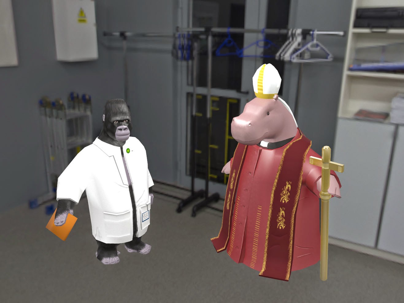
For the re-submission I wanted to re model the hippo character which I explained in an earlier post. The reason for this is because it was a very poor and rushed model which I wasn't happy with at all. So I went back to my original idea for the Dichotomy project the “Hippope” and Scientist Gorilla.

As I haven’t been posting much about my progress with the Hippope I've decided to do it in this post overall and as a bit of a review.

Firstly for the Hippope I went back to my original silhouettes and explored some more interesting shapes, I then chose which one I preferred and did some more polished concepts with different clothing and props. I chose to then post the concepts on Facebook to get some feedback on which concepts were the most liked overall. After getting feedback I made a few adjustments as it turned out that people preferred parts of different concepts, so I just combined them all in a way that worked as a final concept and ran with it.

Here are my 6 concepts each referenced from real Pope clothing 

Final concept taking parts from 1,4 and 5


After choosing a finalised concept I went onto modelling it straight away, annoyingly I had to wait till I was back in Leicester for the last part of the holidays so I could start modelling as I don’t have 3ds Max on my PC in my apartment. This wasn’t much of a disadvantage however as the modelling didn’t take as long as I originally thought it would.
I tried to see if I could just adjust the original model for the hippo but I couldn’t, it just didn’t work. 

So I started from scratch, overall I think it took about a week maybe two to complete all the modelling, unwrapping included. As I was modelling I was very conscious about making it looking like a hippo because the first model didn’t at all so I spent a lot of time reviewing the head of the character as I was modelling. I found in my first few iterations the face of the hippo was too long and looked kind of weird and awkward so I got a load of hippo reference images and just kept comparing until I got it right. I’m quite happy with the model now it’s finished, the topology is ok as it’s fairly low poly there wasn’t much I could do but I tried to get it to flow as much as I possibly could. The final tri count for the Hippope 2,713 which is slightly higher than the gorilla but this character has a more complex silhouette and more clothing.


Here was one of my first iterations which really doesn't look right. 


As i kept working on the face of the hippo comparing against reference images and just going by eye as well I finally got something that looked right and that I was happy with. 

After applying smoothing groups

Topology and tri count

The unwrap wasn’t as efficient as I could have made it but I was fairly happy with it as it didn’t take very long, I’d say about 4 hours for the whole model and then the props and clothing. As soon as I was done unwrapping I went straight into hand painting the textures. As a review on the textures I’d say I definitely could have done better but I still have time to go back and edit the textures a bit like adding more detail and tweaking the normals.


I decided to rig the Hippope really only so I could pose it for beauty renders later on. With the topology and low poly model it wouldn’t be able to walk as it doesn’t even have legs because I modelled just the clothing to save tris. I’m fine this as I didn’t make it go into engine so to speak as I wanted characters that were interesting and fun and really showed off a personality.

Finally I exported the Hippope and put it into Marmoset Toolbag 2. I chose Marmoset to make beauty renders because the gorilla was also rendered into Marmoset and both characters would look better if they were rendered the same. I also really like how Marmoset works and its different backgrounds which both worked well with my characters.

Here are some of the beauty renders of the Hippope in Marmoset:


In my review Mike Powell suggested that I changed some of the textures for my gorilla character as they were fairly simple and boring, so I did.
First I modelled some of the props for clothing separately instead of just being painted on as a texture. This would not only add more to the silhouette but look a lot better as you can see I also added a pen to the props which makes sense.

Heres a concept I drew up to show the changes in the design: 


I’ve always been pretty happy with the gorilla character so I didn’t feel like I needed to do much more to it, I also didn’t want to ruin it. The final gorilla came up to a tri count of 2,520 which I’m happy with as I wanted to keep these characters fairly low poly and a good range for me was between 2000 to 3000 so I did well in my opinion.

Here are some final beauty renders of the gorilla character also in Marmoset:


Finally here are both characters together. I think they're pretty dichotomous. 


Wednesday, 25 March 2015

Action Plan

Objectives
Tasks
Time Frame
Write essay
       Figure out what im going to write about
       Plan the essay
       2500 words
       6+ references
       Review and polish
3-4 weeks (hand in 24th April)
Re-do dichotomy character project
      Concept new idea
       Re model “hippope”
       Unwrap
      Texture
      Polish
      Re do textures for gorilla

3-4 weeks (hand in 24th April)
Finish Off the Map project
      Get all assets into level
      Get all characters working
      Review and polish
      Off the map post mortem

5-6 weeks (hand in 8th May)
Post mortem (15th May)
Presentation
      Find and interesting topic
      Plan presentation
      Time presentation
       Make it interesting and   relevant
       Practice
Presentation (16th-17th April)
Make project more fun and interesting
      Do side projects that interest me
       Do personal work that is based around current project
       Fun, wacky and whimsical
From now

Here is my action plan for the next few weeks and months. I came up with this after my review with Mike Powell as we talked about my progress and how I can make less enjoyable projects more fun. To figure what I could do to make mundane projects and work more fun and suited to me we talked about my most favourite project; the Sentry Gun.

This was by far the best project I've done probably since I've started Game Art. I enjoyed it because we had lots of leeway and could do pretty much whatever we wanted, I also chose something really fun and silly which made it really fun! After thinking about that Mike suggested I do some personal projects of my own that I make for fun.
He also suggested that I do some personal work alongside the current project, for example with the Off the Map competition I could make something that I find fun and interesting but still ties into the project. I do plan to do this once all the work I need to do is finished which will only be about a month from now. I'm excited to get to work on this as just thinking about it brings my passion for game art back as the course has slowly drained it recently. 

Now I have to plan that presentation and get working on the essay before I run out of time and fail at planning my time effectively like I usually do.