Saturday, 26 April 2014

Fable Anniversary continued...


Leading on from my last blog post where I talked about what I wanted to do for my personal enquiry, in this post I’m going to research further into the subject and form a rough draft of my final 1000 word post.

From reading my previous blog post you can see I briefly outlined my idea and some points I could research further into.

These are the short bullet points I made:

  •          Change in visual quality
  •          Why the change is so dramatic 
  •          Texture budget
  •          Processing differences
  •          Actual in game change
  •          Interface
  •          Feedback
  •          Fan reviews

To add to this I want to expand on interviews which the makers of the remastered game have been involved in. I want to add this because it’s a creditable source and makes the information more interesting. 


The changes made with a new system

It’s 10 years ago since the original box version was released and technology has moved on an awful lot in those years, so there are many improvements. Lionhead have used Unreal 3 for the rendering side which has much more improved Lighting, Materials and Effects than the original Fable engine.


An obvious difference is the screen size. The original Fable was created on 4:3 format whereas Fable Anniversary has been created in widescreen. 

The polygon count has been raised significantly for all in-game models, this means the models edges and silhouettes look much smoother. 

The texture budget was also raised for all the assets in the game. You can see the change in detail in the clothing and objects in the room. 

The way materials work and look in games has been significantly improved since 2004. By including Specular Maps, and setting specific values within a material we can now visually distinguish much better between material types. It’s clear in the image that the glass in the windows and the boys belt buckles have a strong specular value set which give them a much shinier appearance, making them look and feel much lore like the materials they are supposed to be.

Normal Maps are also used in games today. These are special textures used as part of a models material to add extra bump detail. These can be seen working clearly in the weave of the rug and the creases in the bed at the back of the room

Lionhead added extra light sources where required to interior levels to create a better lit and more visually appealing environment.  Notice the candle creating a pool of light at the back of the room above the bed.   

They also added dynamic shadow casting to several key light sources, including the interior fireplaces. You can see the long shadows of the Boy and the chair being cast across the floor

Change in User Interface 


For Fable Anniversary the User Interface was updated but not changed completely. Bigger budgets means that the visual quality is better and the interface can be designed in a way so it is user friendly and easy to navigate around. 


One of the first screens players see in Fable Anniversary is the Press Start screen. The difference is very clear. The newer screen really showcases the environment in the game and invites the player into the game so they can continue to explore the world of Albion. 


As seen in these screengrabs the HUD is still quite similar as the creators didn't want to stray too far from the original as this is a remastering and not a remake. So many features were kept the same like the way objects are shown in golden framed elements. However these have been updated to fit on the screen more effectively and they have been made as vector shapes so they can be resized easily and have multiple uses. The Mini-Map also looks more realistic and all of these elements can be disabled depending on what the user wants. 


As with the Region Map shown here we can see that the different elements have been spaced out so more information can be seen and so that it is clearer to see the actual map. The creator of Fable Anniversary's User Interface Jenny Peers said that " I referred to the original Albion map heavily and was keen to try and keep a familiarity between the old and new. By keeping the colours similar I hope that, at a glance, players still recognise it as the iconic Albion map" 

So here is a brief but more insightful look into the work behind Fable Anniversary, how it has been improved with more modern next gen software and how it differs from the original game. 
There is still a lot more information which I want to put into the final post including some interviews and appropriate video links to those interviews if necessary. 

References: 

  • http://www.lionhead.com/blog/2013/november/12/fable-anniversary-ui-old-and-new/
  • http://www.lionhead.com/blog/2013/december/16/remastering-fable-anniversary/
  • http://www.polygon.com/2014/2/12/5406176/fable-anniversary-review-cracked-frame


Friday, 18 April 2014

Fable Anniversary! The reboot of a much loved Original Xbox game


Some of the first blog posts I made were of the history of computers, dating back from the 1850s to the present day. This was all leading to one final post on a personal enquiry into something that interests us in games or the gaming industry historically or otherwise. 

I thought about this a lot and I had a hard time trying to decide what to write mine on as it has to 1000  words and something I find interesting and can talk about in detail.
The art direction task given to us a few weeks ago before the Easter break gave me an idea; to write my personal enquiry on Fable Anniversary, a very recent release from Lionhead Studios. I got the idea as from my previous post you can see that I did my presentation on Fable 3. This got me thinking, why don't I write my personal enquiry on not only a game I love and have previously talked about in depth, but also something really interesting. 


This is where Fable Anniversary comes in. Lionhead Studios, the creators of the Fable series recently made a reboot of the original xbox game Fable, the first of the series. 
The gameplay is the same, even the interface. However it's released on the Xbox 360, a next gen console with the capability to process quicker and with higher quality. 

So this is the first of three posts on my personal enquiry. In this post I research into the topic briefly and make a few points that I plan to talk about in the final post. 


"FOR EVERY CHOICE, A CONSEQUENCE.

Fully re-mastered with HD visuals and audio, Fable Anniversary is a stunning rendition of the original game that will delight faithful fans and new players alike! Imagine a world where every choice and action determines what you become."


The idea of fully remastering the original game: 

What was the original goal with a remake like this, what did you want to achieve?

"Initially we really wanted to just remake the whole thing. But then once we worked out it would take about three years we realised it wasn’t viable. And that’s not really what the fans would want. The fans want a nice excuse to play through the original again. The feedback that we’ve had so far is that they’re ecstatic. I have that feeling towards a lot of games myself, like Halo – it blew my mind. I can relate to the fans’ feelings."


The video below shows a direct comparison of the Original Fable and Fable Anniversary. 


Other points to make: 

  • Change in visual quality
  • Why the change is so dramatic 
  • Texture budget
  • Processing differences
  • Actual in game change
  • Interface
  • Feedback
  • Fan reviews


References: 


Fable III: Art Direction


So for Critical Studies we were set to make a presentation on art direction. This could be based on a film, video game still, concept art or painting. I chose to make mine on Fable 3,the third installment of the Fable series as it's one of my favourite games. 

To narrow this down more I chose one specific concept art for the game which is below. 


This concept piece painted by Emrah Emasli presents a part of the game set in the unforgiving desert wasteland of the game's world. This painting creates a view of the desert as vast and neverending which really puts the player in the character's shoes. Showing the scale of the character in the bottom left represents the challenge the character faces on their journey through this part of the game trekking through a desert and facing many enemies along the way.


When viewing the concept piece against this in game still we can see direct similarities. The jagged rocks pushing out and up from the sand in the concept painting can be seen used in the game in this image. These rocks really show the hazardous nature of the desert as the player faces many dangers as they progress through this part of the game.
The colour is however quite different but as seen from the shadows in the game still this is because of the realtime change in the time. In the concept the sun is bright and still quite high in the sky so shadows are not as prominent, in the game still the shadows are long and dark showing the just set sun and the change into evening. 


All in all I think this concept is translated well into the actual game and presents the story of the game accurately. 

Wednesday, 5 March 2014

Critical Studies: Checklist

I'm still not too sure what job I want within the games industry yet but I'm interested in possibly becoming an Environment Artist so I'll make my checklist for that. 

I'm interested in becoming an Environment Artist as projects such as the Architecture Project and the Foliage Project were not only interesting to make but they both pushed my skills and taught me valuable skills such as time management and thinking about how the assets fit into the overall environment.
Requirements:
  • Create and maintain 3D prop and modular assets
  • Create and maintain texture library
  • Work with the Art team to maintain consistency through the game world
  • Work with the Design team to ensure game flow is optimal around assets
  • Demonstrable experience at creating Environment Art either commercially or on a completed mod with multiple releases
  • Experience in production of textures for foliage
  • Experience in photo realistic texture creation including diffuse, specular and bump maps
  • A great eye for detail and a natural flair for composition and colour
  • Strong traditional art skills
  • Familiarity with 3D modelling packages such as Maya or 3D Studio Max
  • Thorough knowledge of and experience with Adobe Photoshop
  • Good written and verbal English skills
What I need to work on:

  • Composition and colour
  • Thorough knowledge of Photoshop (I need more experience with this software before i have thorough knowledge as the software is generally new to me)
  • Working in a team (my people skills need to be worked on more) 
  • Experience in production of textures ( more experience needed as my textures are lacking somewhat however this will come in time) 
  • Traditional art skills (I'd say my traditional art skills are quite good but can always been improved) 

Most of these can be worked on through working on the course and re doing most of the work I've already done so i can improve and learn from past mistakes. 


Thursday, 13 February 2014

The Ford Transit Van...Thank God It's Over.

Monday saw the end of a very stressful project... the Ford Transit Van.
Due to two weeks of intensive workshops my van didn't come out as good as I would have hoped but if I get time I plan to re-do it.

So for this project the brief was - 

“You will be required to make a Ford Transit Van, this has been chosen as there are plenty of Ford Transits around in order for you to get good photo reference. A van is a good starting point for your first vehicle on the course as it’s shape is box like and a lot easier to start with.”

For the van the technical limitations were - 

· The model must use fewer than 5000 triangles (also called polygons or faces. N.B. if you work in quads remember each quad is two triangles).

· Three texture pages will be required, one 1024x1024 32 bit tga for the main body and semi transparent door windows and front windscreen. One 512x512 for all the interior and one 128x128 texture for the lights. The wheel texture can be on the main body texture page


I kept to the project brief and the technical limitations. And here is my final presentation of the van. 


Then and now..

This post is a short presentation of some old work and my development since starting Game Art Design at university.

The first photo set is my work from A Level Fine Art. 


As oil paintings I can't compare them with any paintings from university work as we have not yet started painting. However we have been using colour which is relevent as I feel that I have learnt how to correctly use colours together to create an interesting composition. 


These studies have helped me understand colours that compliment and colours that contrast and how to use them correctly. This is something that I didn't use in the first two paintings which are from my earlier work. 


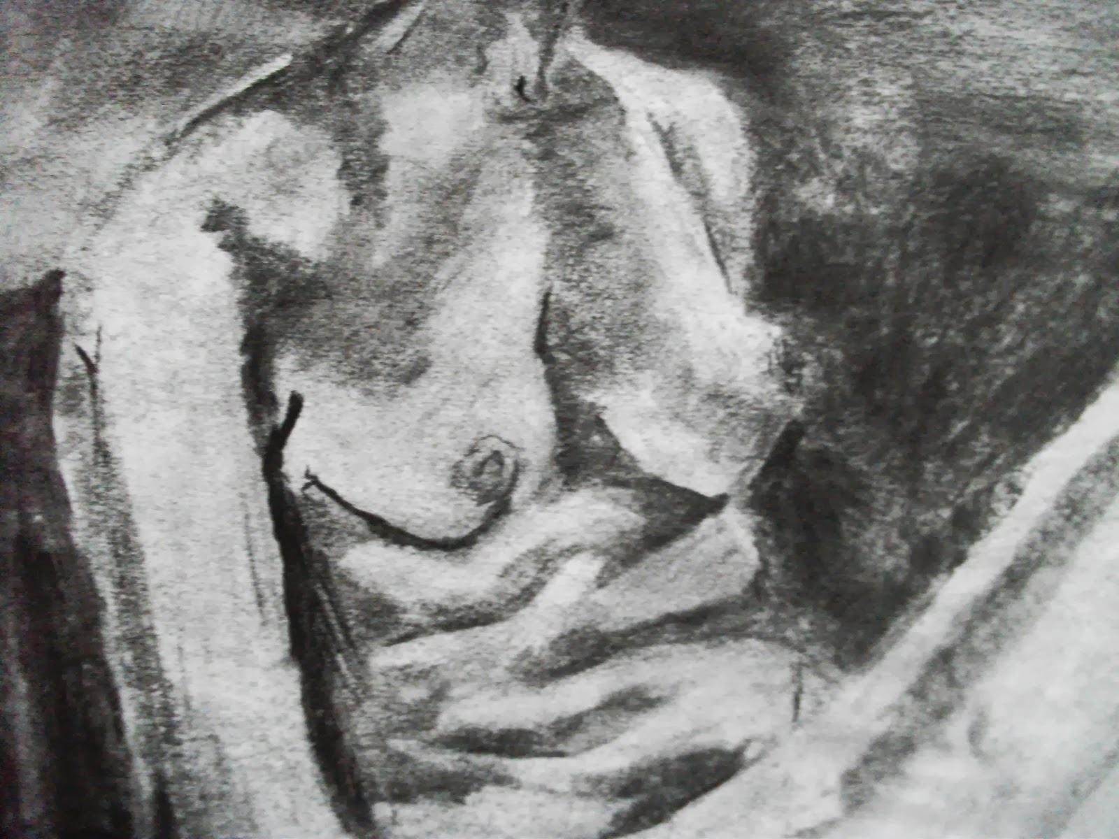
My earlier work in charcoal which I've shown here isn't very good in my opinion and could be refined a lot more. When comparing it to my charcoal work now I feel as if I have improved a lot as I can control the media a lot more effectively and create accurate drawings with it. 


This is just a small update on my artistic development since starting university. I will upload more to show more of my improvements throughout the year. 


Wednesday, 8 January 2014

3D Modelling


This post is an update on my 3D models starting from week 2 and leading onto my current work. 


My first textured model was this telephone box. I found this quite difficult as my first texturing task however I think as my first try it went quite well. 


 The next project was the wheelie bin and to make it a bit different I created it laying on its side like it had fallen over with rubbish falling out of it. I'm not particularly happy with this and I may re-do it in the future. 


One of the projects I found quite fun and interesting was the architectural project which I had to model a building I found interesting. I chose a Tudor house situated in Stratford Upon Avon as I found the Tudor design and age interesting. The model itself was quite straight forward and easy to do, the tricky part came when texturing the Tudor wooden panelling, which I am not very pleased with. However I think the windows and door look very detailed and accurate to the reference images used so I am very happy with them. 


My most current project has been the foliage project. I found this project to have its ups and downs. There were many difficulties when creating these models and before this project I found creating alphas rather confusing, however during the foliage project I found that I understood how to make them a lot better. 
I also learnt how to use new tools such as the Hair and Fur Modifier which I used to created the grass surrounding both trees. 
LODs were also a new thing I learnt from this project and learning how to make them proved quite simple and useful.